The Principles of Art
How do you arrange elements on a page so that the viewer understands your idea and feels the energy you want the piece to have? Use these ideas to plan out your spaces and communicate your idea.
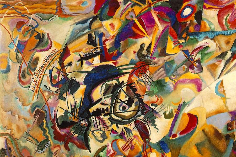
The PRINCIPLES of ART are:
BALANCE and IMBALANCE
EMPHASIS and DE-EMPHASIS
HARMONY and CONTRAST
MOVEMENT and STASIS
PROPORTION
PERSPECTIVE and DEPTH
VARIETY
The PRINCIPLES of ART are:
BALANCE and IMBALANCE
EMPHASIS and DE-EMPHASIS
HARMONY and CONTRAST
MOVEMENT and STASIS
PROPORTION
PERSPECTIVE and DEPTH
VARIETY
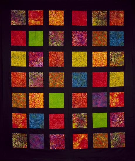
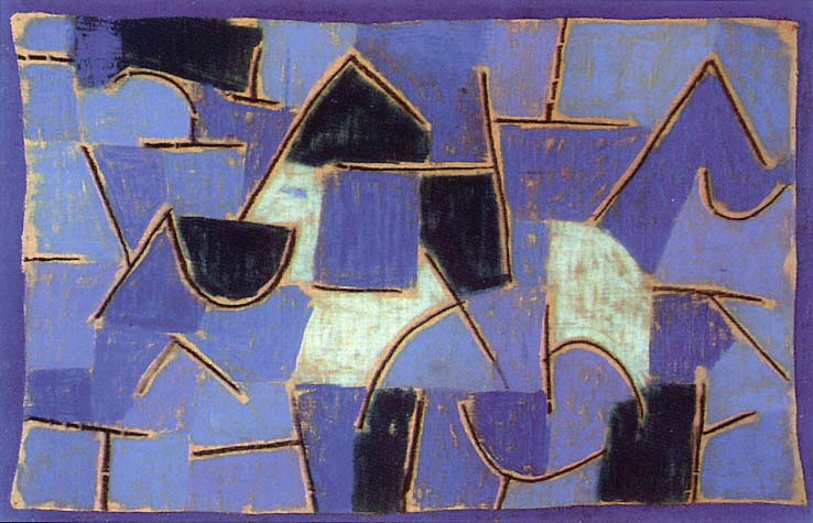
BALANCE means that elements are evenly spread out within a space. There is a sense of even visual weight in the design and all spaces feel equal. BALANCE feels emotionally stable, strong, and calmer than its opposite. |
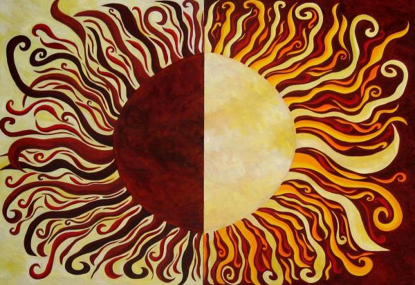
IMBALANCE means that elements are NOT even -- they are arranged in lopsided, uneven ways so that one area of the design "feels" heavier or "louder" than others. IMBALANCE creates a feeling of tension and energy in a work of art. |
|
|
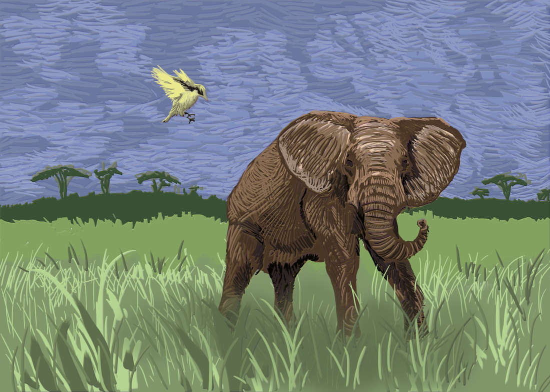
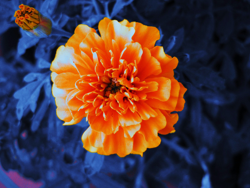
EMPHASIS means an element or part of the artwork shows up the most and catches the viewer's eye because it is bigger, bolder, or brighter than other parts of the design. If you notice it first, it is emphasized! |
DE-EMPHASIS means that an element or part of the artwork does NOT show up the most because it is not the biggest, boldest or brightest part of the design. It plays a "supporting role" to the part of the composition that is the main idea of the piece. |
|
|
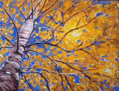
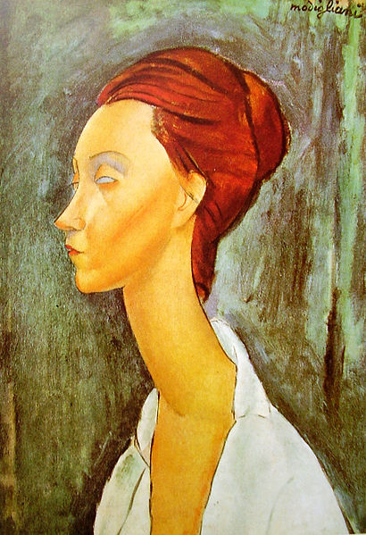
HARMONY means the elements in a composition share a visual quality or characteristic that makes them flow together. Repeating shapes, colors, lines and other elements connect up with each other in a work of art, and give a calm, easy, flowing feeling to the design. |
CONTRAST is the opposite of harmony -- elements in a composition DO NOT share a quality or characteristic. One element "stands out" from another because it is different. CONTRAST creates an area of emphasis in a design called a "focal point." Contrast also creates edgy, visual tension in a design. |
|
|
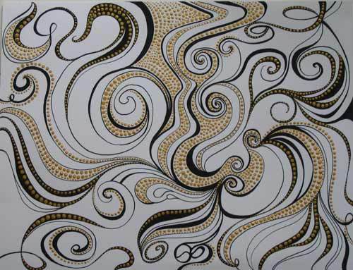
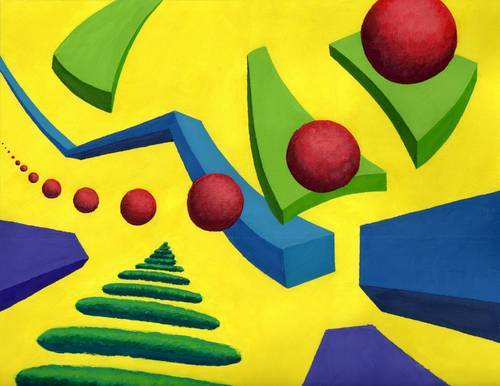
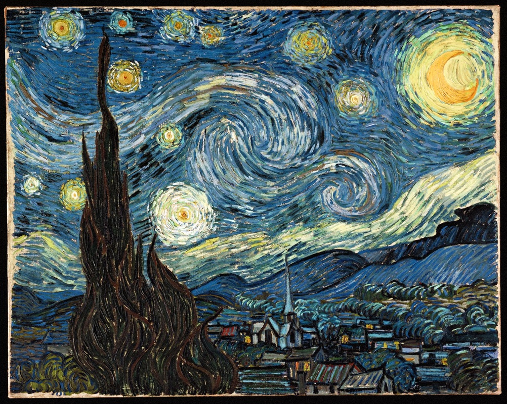
MOVEMENT means the viewer's eye moves through a composition because of choices made about lines, shapes, patterns, and colors. Curved and diagonal shapes and lines create a sense of movement. Patterns also create movement. Movement gives a work of art energy. |
STASIS means stillness. When the viewer's eye does not move around the space of an artwork, it has stasis. Straight horizontal and vertical lines in a design create stasis, as well as elements that do not repeat. |
|
|
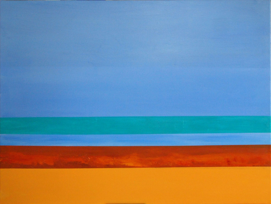
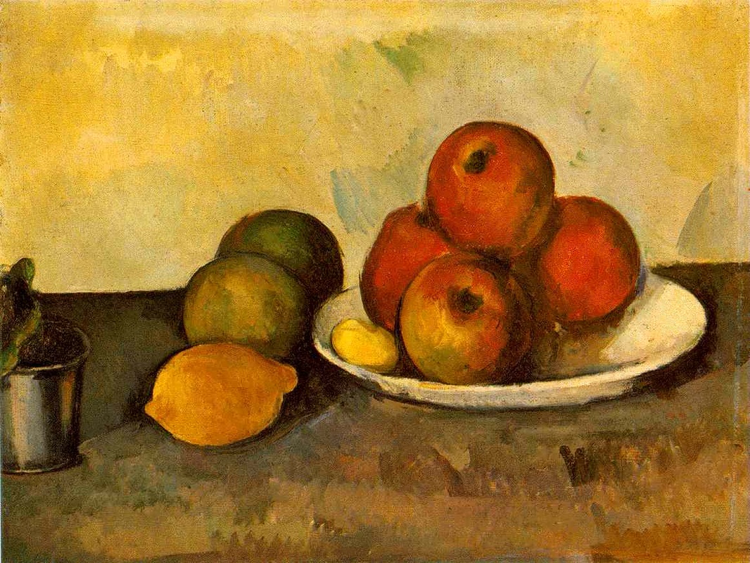
PROPORTION means the amount of an element in one part of the design compared to the amount of the same element in other parts of the design. "IN PROPORTION" means there are elements that are sized in a natural or realistic way, and something is "OUT OF PROPORTION" means the elements are not sized in a natural or realistic way.
|
|
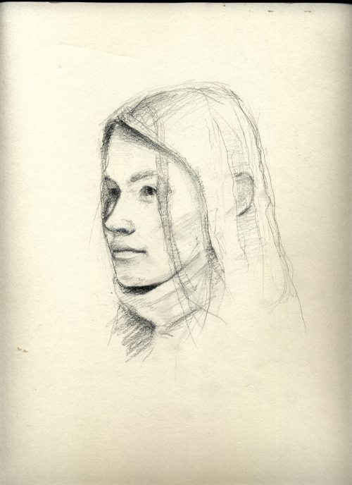
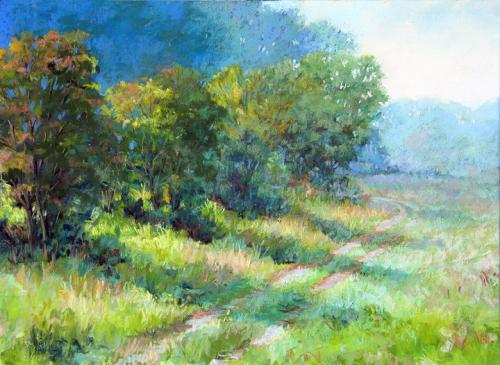
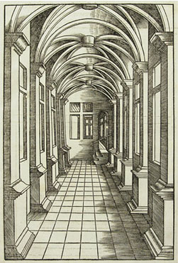
PERSPECTIVE AND DEPTH means the way three dimensional space is shown or used in a work of art. Overlapping, making colors more cool as they go back into space, creating parts at different sizes, and using linear perspective are ways artists show depth.
|
|
|
|
VARIETY means that an element repeats within a work of art, but each individual part has different qualities. The repetition of an element makes a pattern, and if there is some VARIETY in the pattern, it can be more interesting to look at.
|
|
|